
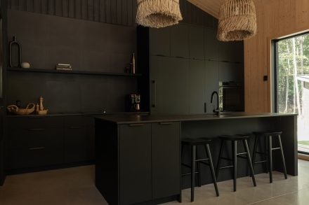
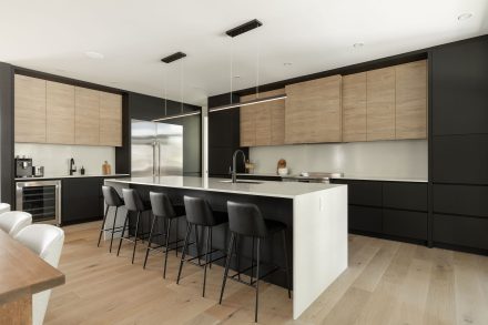
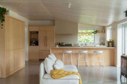
Hello, it’s a great day to start a project.
We unveil the seven shades that will set the tone in 2026.
Text: Marie Charles Pelletier
The year 2026 begins like a slow, grounding breath, the kind that gently shifts our internal rhythm. This colour palette doesn’t try to stand out or chase the moment. Instead, it responds to a deeper collective impulse: to reconnect with nature and with ourselves.
Each shade becomes a bridge between the inner and outer worlds, and the sanctuary we create at home, echoing both landscapes and emotions.
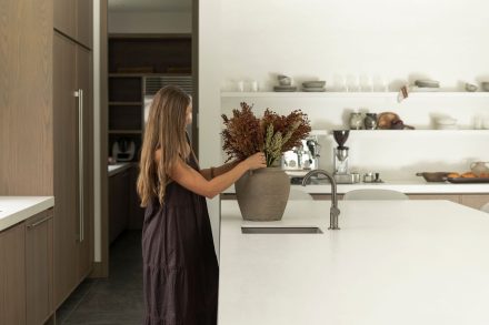
The 2026 colour trends embody a renewed desire for simplicity, balance, and harmony. Here are seven colours that invite nature indoors, each in their own way.
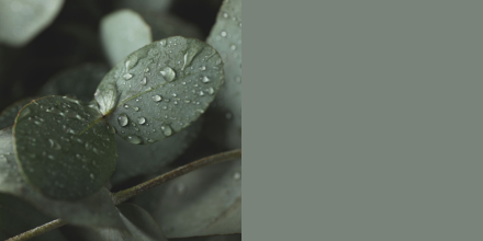
Valspar’s 2026 Colour of the Year Warm Eucalyptus is a plant-based hue with a regenerative effect that naturally invites you to slow down. With this green, the indoors dissolves into the outdoors: walls become an extension of the landscape, and light filters in like sunbeams through a forest canopy.
Restful to both the eye and the mind, Warm Eucalyptus turns a room into a suspended haven evoking damp moss, the scent of sage leaves, and the texture of a slate path.
Psychological impact: Soothing and regenerative, this hue evokes calm and confidence, creating a serene atmosphere that soothes the senses.
How to use it: Perfect in a light-filled bedroom or kitchen, combine it with light woods, sandy tones, and natural textures to create a harmonious and enveloping space.
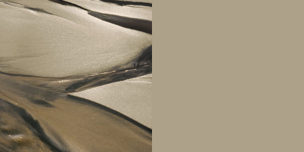
This sandy beige with khaki undertones evokes soft clay, sandstone, and sun-baked land. It diffuses light with a gentle veil draped over a wall, creating a cozy atmosphere.
HGTV’s 2026 Colour of the Year Universal Khaki brings grounded softness to living rooms and dining rooms, embodying a return to essentials and a comforting neutrality.
Psychological impact: This sandy beige brings a natural balance and softness that contributes to a feeling of comfort and serenity.
How to use it: Pair it with light woods, natural textures, handcrafted ceramics, and neutral textiles to create a harmonious and balanced space. For a matte finish, opt for a soft, muted effect and softened light.
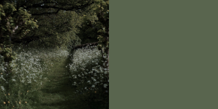
In this muted, almost mineral green, the silence of ancient forests resonates. Dunn-Edwards’ Colour of the Year 2026 Midnight Garden is an earthy green that invites introspection and calm.
It inevitably structures the space while reminding us that home can be a sanctuary, a respite from the world’s turmoil, a place to pause and catch our breath.
Psychological Impact: Soothing and introspective, this colour promotes relaxation and reflection by structuring the space and bringing the forest indoors.
How to use it: This versatile green can be used both indoors and outdoors, on walls, furniture, or decorative accents. It pairs beautifully with natural materials and light woods to enhance the feeling of being a refuge.
Infused with burnt umber and anthracite undertones, this shade offers a velvety texture that captures light without reflecting it. Silhouette is part of Benjamin Moore’s 2026 Colour Trends palette, where pale tones and mid-tones interact naturally.
It evokes the silhouette of trees at dawn or the shadow of foliage dancing on a wall, lending the space an intimate and subdued ambiance. Applied on facing walls, its velvety finish invites slowness and inward focus.
Psychological impact: This soft shade gives the room a depth that invites relaxation, slowness, and introspection, creating a calm and enveloping atmosphere.
How to use it: Use it on front and back walls with a velvety finish. On doors, a semi-gloss finish adds a subtle sheen and makes maintenance easier. Pair it with light, natural tones.

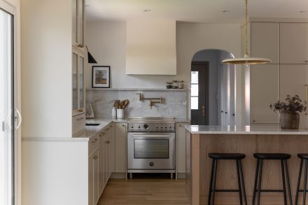
This warm white recalls early daylight, pale sand, and the soft light of a winter sky. Swiss Coffee is part of Benjamin Moore’s 2026 Colour Trends Palette and has been one of its signature colours for years. This shade is reminiscent of the surface of a polished seashell and the natural textures of linen and limestone.
Essential and calming, it brings lightness and subtle warmth to any space.
Psychological impact: A tranquil white that allows light to breathe through the room.
How to use it: Ideal on all walls to create a bright and timeless backdrop. Highlights beautifully the natural tones of walnut, maple or light oak furniture.

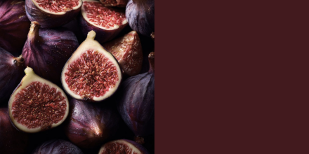
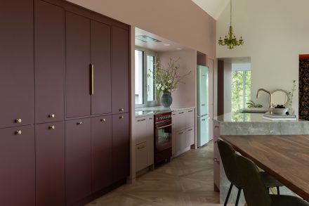
Between the rich hues of ripe damson plum and fig, Graham & Brown’s 2026 Colour of the Year is an opulent shade that exudes a muted intensity. Its evolving depth plays with light, revealing hints of blackberry and garnet that evoke the forest floor in autumn or the dark skin of a ripe fruit.
With its slightly dramatic edge, Divine Damson transforms a room into a sanctuary — a place to sit, slow down, and find solace.
Psychological impact: Reassuring and introspective, this colour creates a sense of intimacy and comfort, encouraging slowness and tranquility.
How to use it: in a living room or dining room, pair it with natural materials and gold accents to bring warmth and character while enhancing the room’s elegance.
BEHR’s 2026 Colour of the Year Hidden Gem captures the essence of undergrowth, wet stones nestled beneath forest moss, with a depth that evolves as the light changes. In the morning, it appears as a soft, delicate green; in the evening, it deepens into a mysterious, enveloping blue-green.
This green evokes the changing light filtering through the leaves of an oak tree as much as the deep nuances of a forest that, like us, breathes.
Psychological Impact: A symbol of balance and calm, this green creates an inner sanctuary. It fosters a sense of connection to nature and grounding, radiating a quiet elegance that evolves with the daylight.
How to use it: Ideal for living rooms or libraries to create an enveloping atmosphere, it goes well with sand tones, natural woods and touches of gold or brass to create a warm and inviting contrast.

These seven colours form a setting that embodies a return to the essential. They don’t chase an era; they aspire to permanence, serenity, and well-being.
Above all, they reflect a collective need to reconnect with nature, to let light bathe our spaces, and to immerse ourselves in silence. Choosing a colour goes beyond mere aesthetics: it’s an act capable of blurring the line between inside and outside, of infusing a room with feeling and depth, or simply of profoundly calming us.
In 2026, painting a room means inviting nature into your home—in the stillness of dawn, in the shadows of trees dancing on the walls, or in the golden light of dusk. The trendiest colours of 2026 invite us to slow down and choose shades that transform our interiors into sanctuaries, cocoons where we reconnect with the present moment, with our surroundings, and with ourselves.


