
Hello, it’s a great day to start a project.
Trends emerge, stick around, then fade away. But which ones are safe bets? Read on to discover the absolute top trend of 2024!
So you want to know what the kitchen trends are in 2024? We got you! As kitchen designers, we like to stay on top of what’s hot, but we also stay away from passing trends to avoid our clients regrettable choices. What we are certain of is that trends change, styles fluctuate, but the needs to be met remain the same.
« Beyond all others, THE biggest trend of 2024 is
PERSONALIZED WELL-BEING »
You and your family deserve a space that brings you the ultimate well-being experience every day. An experience that is tailored to your specific tastes and needs. A bespoke kitchen! With that in mind, feel free to roam the current trends and to decide if they align with your personal preferences!
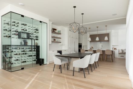
The 2024 most popular trends that are worth your attention:
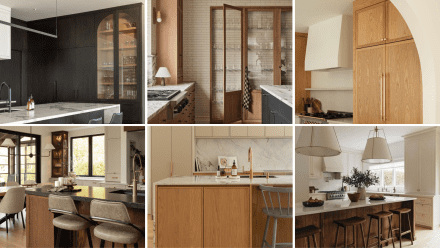
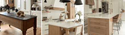
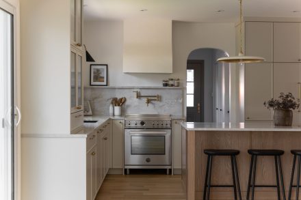
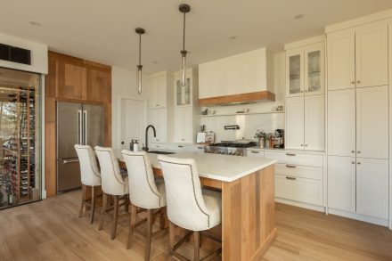
Styles / Individualistic or Approachable
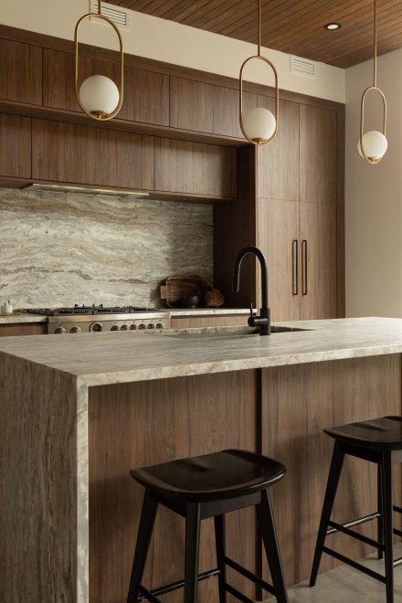
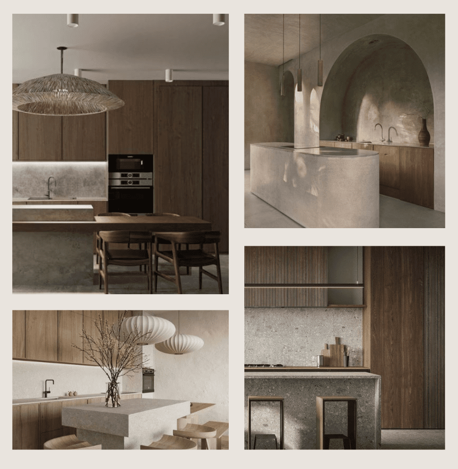
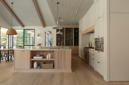
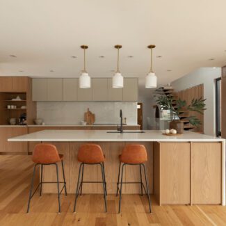
Materials / Nature reigns
Colours / Bold or Neutral, what’s your vibe?
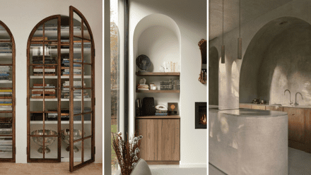
Concepts / An ode to ancient architecture
Trends that are dead (and for good reason)
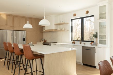
In 2024, the major styles will find themselves at odds with each other. Between maximalism and minimalism, there is a world! Likewise for the enormous space existing between the Hipstoric and Japandi style. To us, each style falls into two categories: Individualistic and Approachable.
An Individualistic style has the owner of the house’s signature all over it. It heavily relies on your own character and personal preferences with little to no consideration for other people’s opinions or even an eventual buyer’s interest. These styles are all about YOU!
An Approachable style, on the other hand, may be more palatable to most. It may also be a reflection of your personality, which is what we are focusing on this year. Here, we are not talking about bland, characterless spaces. We are talking about carefully curated styles that aligns with your personality, the latter just happens to be, well, approachable!
(INDIVIDUALISTIC)
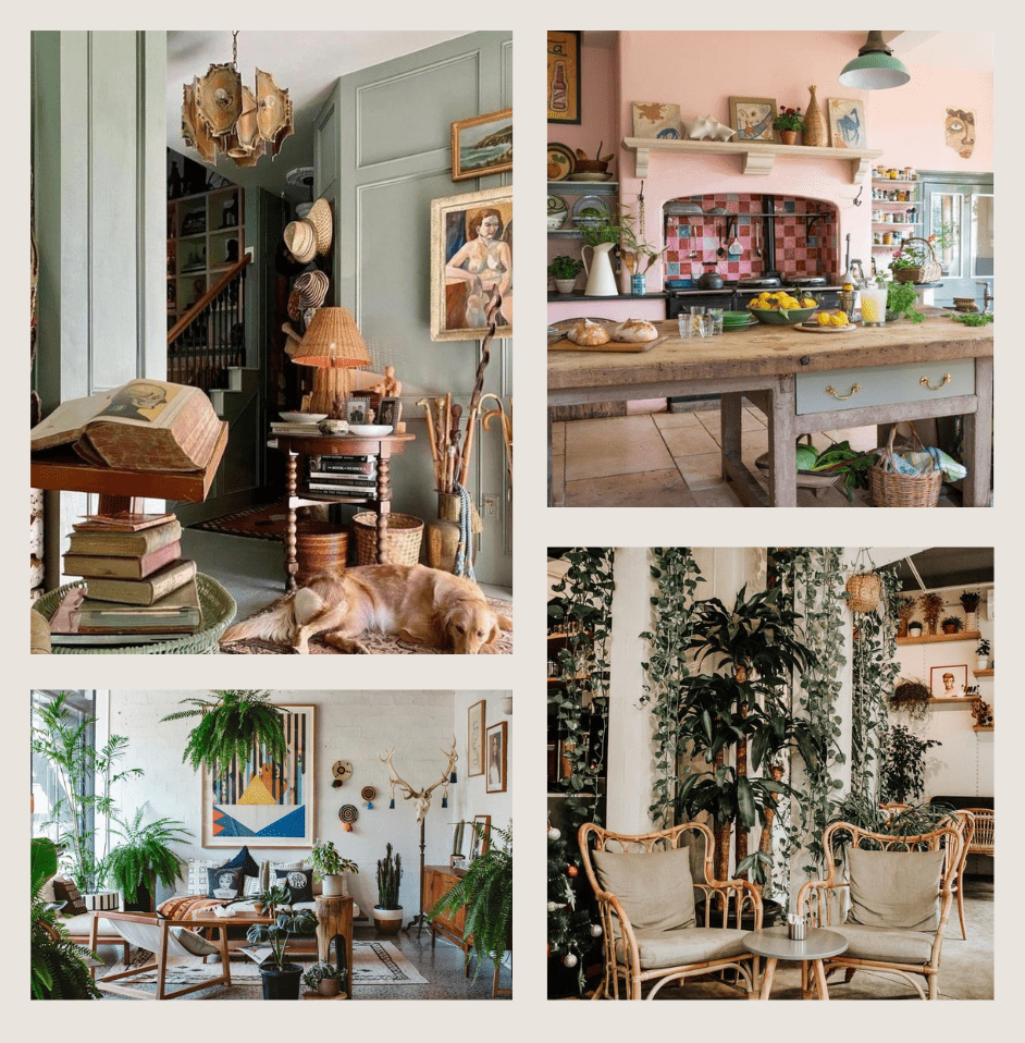
Maximalism is a bold and dynamic design approach that embraces excess and celebrates individuality. It is characterized by using an eclectic mix of patterns, colours, textures and objects to create visually rich and layered spaces.
Maximalism encourages the incorporation of many decorative elements, such as artwork, accessories and textiles, creating a visually stimulating and personalized environment.
This design style moves away from minimalism and embraces a philosophy of abundance, allowing for creative expression and a sense of opulence in interior spaces.
(INDIVIDUALISTIC)
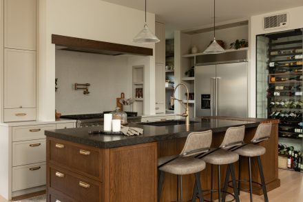
The Hipistoric style is a unique and eclectic mix of vintage and contemporary elements that creates an aesthetic that is both nostalgic and practical. This design trend embraces the combination of old and new, allowing the creative freedom to mix different interior styles and themes. It incorporates vintage pieces, such as antique furniture, vintage door handles and vintage-style mirrors, as well as modern design elements.
The Hipstoric style creates a seamless flow between vintage and modern pieces, reflecting your personal sense of style. With an emphasis on nostalgia and individuality, Hipstoric interior design adds character and charm to any space.
(APPROACHABLE)
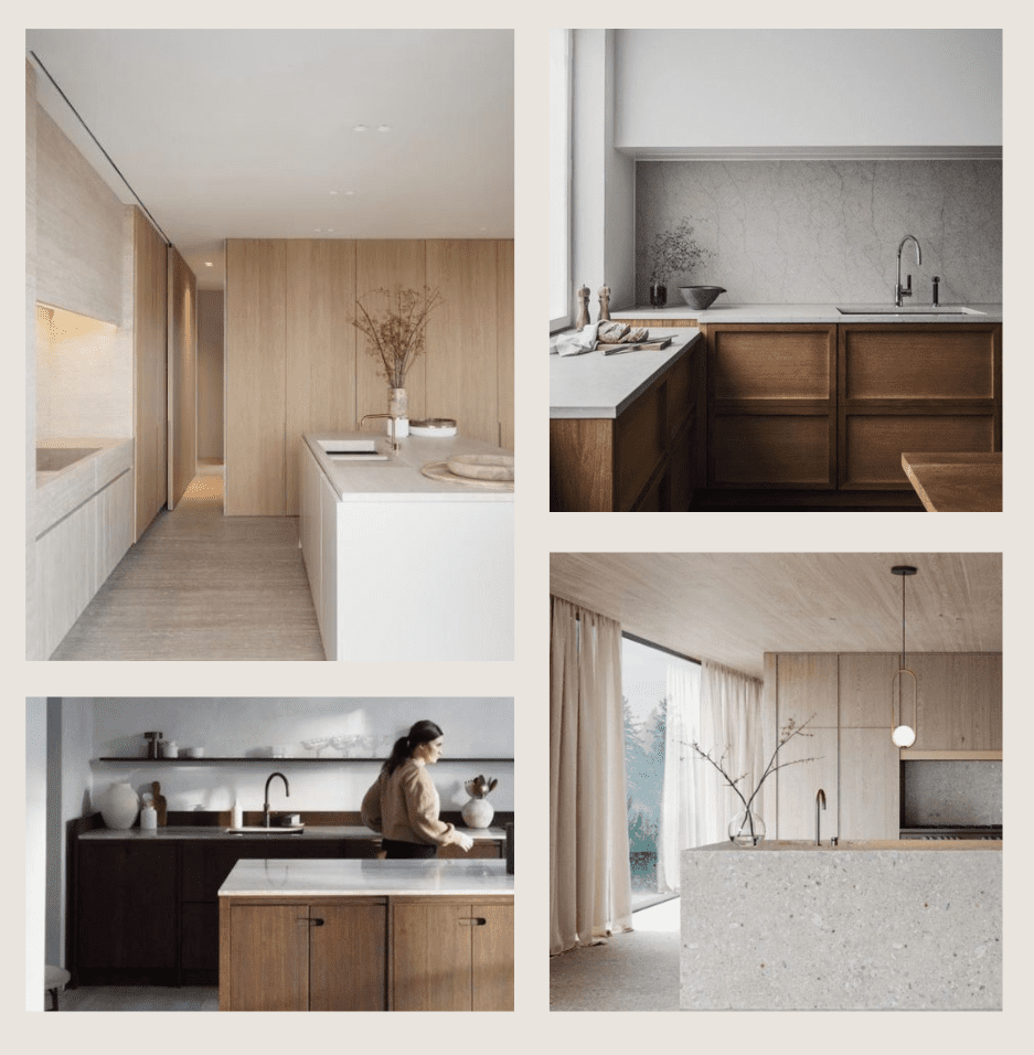
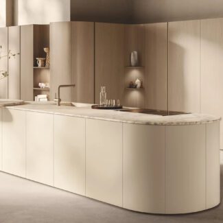
Minimalism is a design approach that emphasizes simplicity, functionality, and minimal ornamentation. This style embraces clean lines, open spaces and a neutral colour palette to create a feeling of calm and tranquility in the living space. Minimalist interiors often feature clean surfaces, lots of natural light and the use of high-quality materials.
The goal of minimalism is to remove unnecessary elements and create a space that is visually appealing, practical and promotes a feeling of serenity.
(APPROACHABLE)
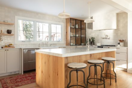
Japandi is a fusion of Scandinavian and Japanese design elements, creating a harmonious blend of minimalism and natural aesthetics. This design trend emphasizes clean lines, simplicity and functionality, while incorporating organic materials and a neutral colour palette.
Japandi interiors often feature natural wood, soft textures and an abundance of natural light.
The goal of the Japandi style is to create a peaceful and balanced living space that promotes a feeling of calm and serenity. It combines the timeless elegance of Scandinavian design with the conscious simplicity of Japanese aesthetics, creating a unique and welcoming atmosphere.
Natural materials have been shown to have a significant psychological impact on individuals, resulting in positive effects on their emotions, general well-being and overall satisfaction with their environment. These findings highlight the importance of incorporating natural elements into our built environments to promote a sense of calm, relaxation and connection with nature.
To this end, no matter the style, choose materials that are as natural as possible. When it’s not possible, choose materials that imitate the textures and finishes found in nature.
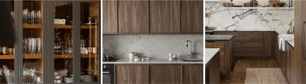
White Oak has been very popular in the last few years, especially in its bleached or toned form. In 2024 we expect to see it in those shades just as much but also in a much darker register. We love a deep and dramatic tone on White Oak! If you go dark, almost opaque, this species will still show depth because of its intense grain. We love this combination!
Maple has been a staple of kitchen cabinetry for centuries. In the last years, White Oak took over, leaving little room for Maple. But we are seeing a strong trend for a comeback and we are not mad about it. Maple is a great wood option because it’s easy to stain and it’s not overwhelming the space with deep grain or movement like the other two species on this list. Again for this species, dark tones are expected in 2024.
Walnut is a noble species option for your home. It has panache and depth galore! The downside for some people with this wood is that it has a ton and a half of character and changes a lot over time. A way to circumvent this issue is to stain it with a shading and this is how we see this species taking its rightful place in kitchen design in 2024.
Natural stone is a timeless element in kitchen design that effortlessly connects us to nature within the confines of our homes. Its earthy textures and organic patterns ground the space, infusing it with a sense of warmth and tranquility. Beyond aesthetics, natural stone offers practical advantages, such as exceptional durability and heat resistance, making it an ideal choice for high-traffic areas like the kitchen.
However, it’s important to acknowledge the unique characteristics of different stone types; for instance, while marble exudes elegance with its veining patterns, it is porous and requires regular sealing to prevent staining. Embracing natural stone in kitchen design entails a love for the inherent variations and imperfections that come with aging materials, adding character and charm to the heart of the home.
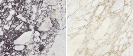
Marble is probably the most coveted stone in the world and the most ancient in its use throughout history. That being said, marble is absolutely gorgeous and will make you fall in love, but it’s also fragile and porous. Knowing this, if you still love this stone and are willing to live with the downsides, here are two noteworthy stones:
Calacatta Viola | Calacatta Oro
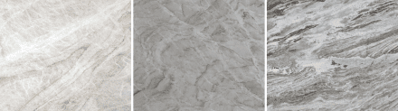
This is a perfect stone in our opinion! We love that it has all the dramatic charm we love about marble, but none of the disadvantages. It’s easy to maintain once sealed, tends not to be porous and delivers a serious hit of style! Without further ado, here are some of our favourite quartzites!
Taj Mahal | Vancouver | Fantasy Brown
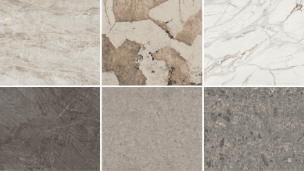
Whether paying homage to the elegance of natural stone or achieving a sleek, contemporary look, Dekton elevates spaces with its enduring beauty and unmatched performance. Engineered through innovative technology, Dekton surfaces boast remarkable resistance to scratches, stains, and high temperatures, making them exceptionally practical for kitchen countertops. Here are some of our favourites:
Taga | Khalo | Lucid | Kira | Vk03 Grigio | Gk07 Ceppo
In an individualistic style, colour choices are often bold, unique and personal, reflecting each person’s personality and tastes. We see this type of choice in the Maximalist and Hipstoric styles. On the other hand, approachable styles typically involves neutral or universally appealing colours to ensure the space is comfortable and inviting to a wide range of people. This type of choice is generally found in Minimalist and Japandi styles.
Whether your nature leads you towards one choice or the other, what matters is that it is respected!
This year, as usual, many companies have come out with their Colour of the year, but very few offered colours we would apply to kitchen cabinets. At Ateliers Jacob, we put our foot down when it comes to creating kitchen cabinetry in wild colours for the sake of a trend. If it’s absolutely you and resonates with your personality, we’re on board, but there are ways to create a design as a whole and ensure it will last through time with changes that won’t involve huge investments while still resonating with your boldness!
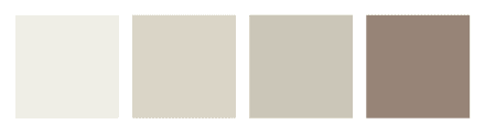
Here are some choices in a colour palette we believe is trendy but also timeless on cabinetry whether you go for Bold or Neutral.
OC-17 White Dove | OC-14 Natural Cream | HC-172 Revere Pewter | 2107-40 Driftwood
1358 Dark Walnut | AF-170 French Press | 1560 Antique Pewter | CW-85 Randolph Gray

The most reliable trends are usually related to how ancient their origins are. If something has been in and out of style for centuries, it’s a good bet that if you love it, it will be a wise choice. Now add to that recipe a little bit of balance and you should be on your way to a timeless design that is exactly you!
Here are some of the most popular trends of 2024 that we believe we will keep seeing more of and that will age well if designed in a measured way.
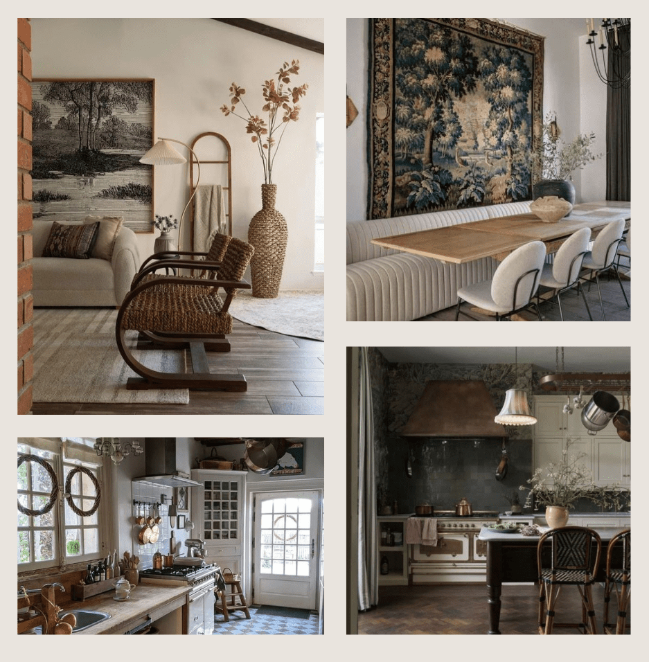
1. Arches all the way!
Arches have made a major comeback over the last few years. We believe they are here to stay but in a more measured way. You see, the trick is to include them in such a way that you won’t feel the need to rip EVERYTHING out in a few years! One way to do so is to restrict the use of arches to one material/area.
For example, you may decide to use arches for doorways but not in your cabinetry and vice versa. And you should definitely be mindful of the radius! If there are multiple arches in your home, make sure the radius is the same or close enough to be forgotten. Different radii in multiple arches will make it look thrown together with no forethought.
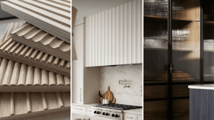
Fluted styles and materials have left an indelible mark on architecture for centuries, their enduring appeal transcending time and trends. Originating in ancient Greece and Rome, fluting, characterized by its vertical grooves, has graced columns, pilasters, and facades, imbuing structures with a sense of grandeur and sophistication.
Today, this timeless design element continues to captivate in modern interiors, where it adds depth, texture, and visual interest to furniture, cabinetry, and architectural details. Fluted surfaces evoke a sense of heritage and refinement, effortlessly blending classic elegance with contemporary flair. Embracing fluted styles in a thoughtful and timeless manner allows for the creation of spaces that resonate with history while remaining relevant and captivating in the present day.
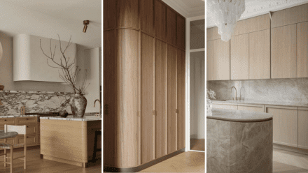
Curves offer a captivating juxtaposition to the linear elements commonly found in kitchen design. Beyond their aesthetic appeal, curves introduce a sense of softness and fluidity, inviting a feeling of warmth and comfort into a room. Cleverly incorporated, curves can add architectural interest by breaking up rigid lines, creating visual movement, and enhancing the overall flow of a space.
These organic shapes evoke a sense of harmony and balance. Harnessing the power of curves in interior design allows for the creation of dynamic, inviting environments that engage the senses and inspire creativity.
Some trends must eventually die out, and in general, we aren’t sad about that!
Here are a few of them. Some should absolutely go, others can be questioned or simply adjusted.
This trend falls into the category of those that must go! Of course, we love white as much as you do, you can definitely get creative with it. However, white has dominated our clients’ choices and those of designers for too long, simply because it is a safe and neutral option. It often goes something like this:
“I’m afraid I’m going to get bored with colour…let’s go with white.”
“I’m worried that the next buyers won’t like it…let’s go with white.”
These thoughts are about neutrality at all costs. They are also filled with fear. All the great creators of this world, past or present, have defied fear of any kind to offer us works that have an impact on us. We believe that:
If all white is your vibe, do it! But not for the sake of what others will think 😉
This trend has been around for a while and is simply no longer welcome. This trend appeared around 2010 when Quebec fell under the spell of the very cold and bare Italian High Gloss kitchens. We were tired of wood and moldings and wanted a kitchen with straight lines and no personality.
We tried it long enough to know that it just didn’t work for us. The proof is that we are currently experiencing a return of the pendulum, revisiting moldings and wood, the warmth of natural tones and materials. However, this has certainly taught us to simplify a bit!
We no longer want to see the coldness of ultra-modern kitchens that don’t allow us to feel connected to our living space, such as white on white on white, cold and soulless gray, or High Gloss finishes. We’re simply somewhere else in our design evolution… and we’re happy about that!
This trend should be questioned rather than eradicated. For the past few years, black handles on white cabinets have taken over the decor on TV shows and in magazines.
Today, we question this trend in order to find its place rather than scattering it everywhere without thought. Do black handles look good? Yes. Are we tired of seeing them everywhere? Also, yes.
What about a black handle on a dark wood cabinet? Ah, interesting! And why not leave room for other metal colours? An oiled bronze can replace black and add depth and warmth. On a white cabinet, black is extremely contrasting. Why not go with champagne brass or pewter instead?
Question this trend and see if it represents you or if you’ve just seen it so much that you lack inspiration.
Here’s a trend to adjust. Cool shades of gray are clearly out. Even paired with wood, it’s a no go. We don’t like cold tones anymore, but how do we adjust this trend? There are many warm shades of gray that appeal to us. Between warm gray, greige and taupe, the universe is the same and it suits us very well.
The gray trend was much too intense, we saw gray kitchens on gray floors with gray countertops … all very cold and impersonal. Having read the article so far, it’s obvious that we are drifting away from the impersonal and replacing it with a mix of assertiveness and timelessness.
This year is all about personalized well-being!
Be yourself, personalize your space. With the help of a qualified kitchen designer, you can transform your personal style and give it a timeless appeal. Your bespoke kitchen will make you feel at home like never before!


